The Transformation Process from waymakrs to BorderX


waymakrs is now BorderX. To tell the story of BorderX, we begin in 2020 with an opportunity. We encountered brands looking to break into the global market but facing obstacles that they weren’t sure how to break. waymakrs began as a way to fill a void in the marketing industry, helping supply this demand.
In the course of 3 years, waymakrs’ vision, mission, and direction were coming into focus in a way that didn’t fit the mold of the old brand anymore. We wanted a way to show our passion for unlocking potential through our unique service scope and philosophy through a stronger brand identity.
Though waymakrs was gaining traction in building expertise and experience, the agency branding wasn’t reflecting its ambitious vision in a clear and consistent way. Through the process of rebranding, we hoped to establish a distinct positioning and set clear goals for the future, communicating all of this through a cohesive tone of voice and visual identity system. If we wowed people with our creative chops along the way, that was an added bonus that would add value to our agency.
The name BorderX resonated with our constant pursuit of going beyond borders. The name drew attention not only to our global aspirations, but also to our role as leaders exploring the unknown and challenging the status quo.
Because we saw ourselves as such a unique agency, categorizing BorderX presented challenges as well. After a lengthy research and contemplation process resulting in numerous (and some very wordy) categories, we landed on global-native digital agency. We felt that this best captured the two key essential components of our unique agency’s offerings, blending our unique selling point (global services) and encapsulating our various services in the digital realm.

In order to be reborn, we needed to think about how we would describe ourselves at the present moment. As a team, we came up with words that would capture the personality we wanted to express in our new identity. The brainstorming process looked something like this:

After squaring away the details, we broke ground on the production phase of rebranding. In order to do efficient branding, we had to constantly ask ourselves if the copy and visual identity aligned with our new brand strategy. Because of this, the whole process was messy, interconnected, tangled, and lengthy. But the results were show-stopping, supporting our goals, purpose, and unique personality in just the right way.
Copy
Getting the right message delivered to our audience meant that we would need demonstrative rebranding copy to create a unified front.
Values: Distilling our core beliefs into 4 words took sifting through our descriptive words with a fine-toothed comb. We recruited the help of our whole team, coming up with words and beliefs that defined the culture of the team. As the list grew longer, we placed them into categories, gradually shaping them into our 4 values. As we defined values, we needed to be mindful of the connotations of words. For example, we initially used the word “optimism,” but decided on “impact” instead, as it better expressed the end result of our positivity and passion for our work.

Vision/Mission: In order to state our mission and vision, we needed to ask ourselves some deep-reaching questions. What is the unique purpose of our agency? What do we want to contribute to the future of our global community? And how do we communicate these ideas in concise ways through rebranding?


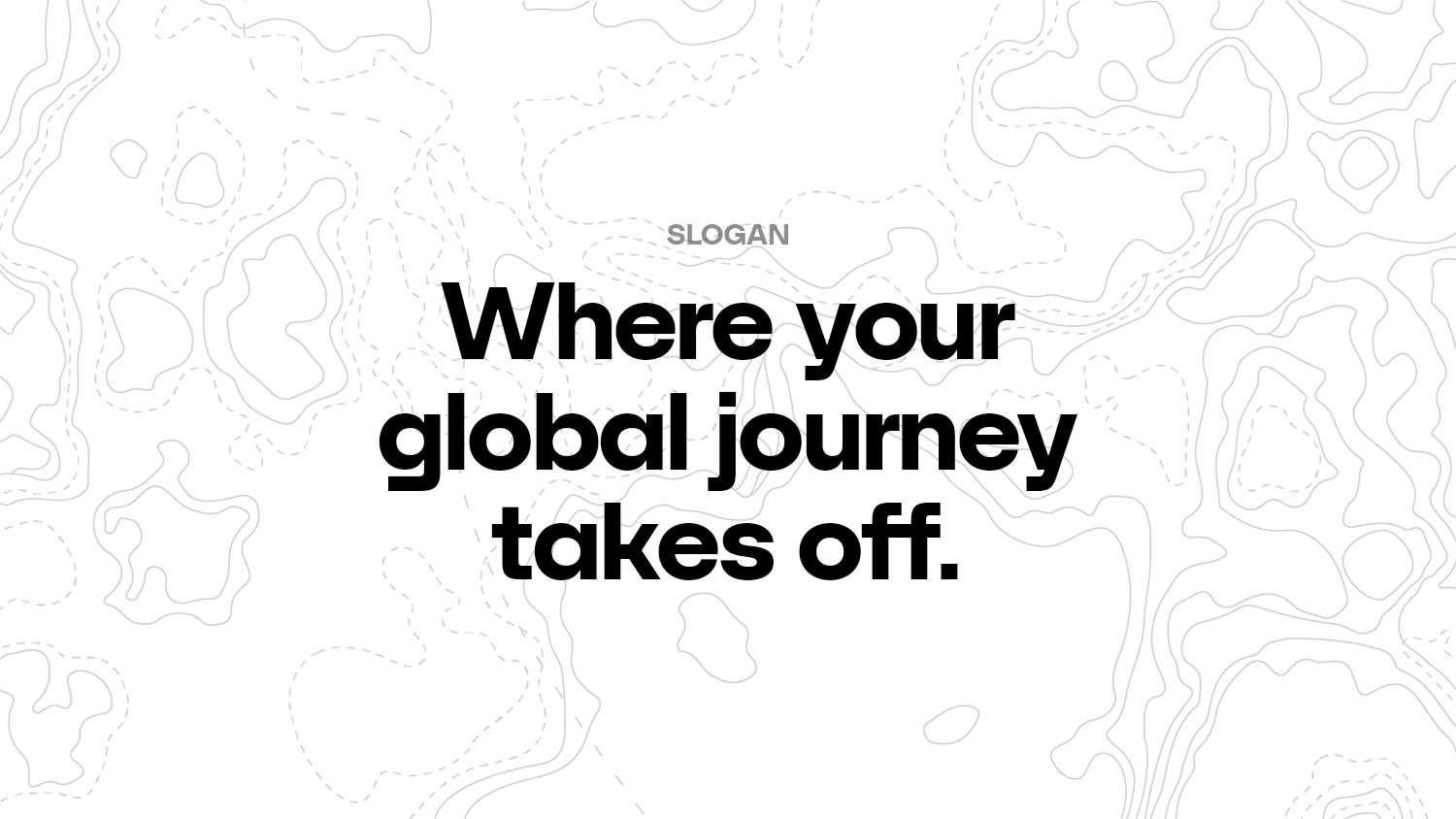
Tagline/Slogan: If vision and mission statements were concise and straightforward, the slogan and tagline needed to be concise and also memorable. We began similarly with many, many word associations. The slogan was meant to capture BorderX’s services whereas the tagline was meant to conjure up bigger values, so we needed to make sure to differentiate between the two to serve distinct purposes. Narrowing down from long lists of potential slogans and taglines, we selected a slogan and tagline that naturally depicted action and a global journey.
Tone of Voice: While we pulled from our descriptive words to help define our tone of voice, we went a step further in defining exactly how we want to sound on each platform. Depending on the type of social media platform for example, we wanted to differentiate and adapt, while maintaining a consistent personality throughout all outlets.
Visual Identity
Finding a visual method to clearly communicate our brand identity also required an eye on consistency, with plenty of flair to make our hard work shine.
Logo: In creating the logo, we first began by deciding on the concepts we wanted to emphasize about our brand. We had two main options: one of exploration, and the other of digital transformation. While digital transformation gave rise to two fantastic logo designs, we ultimately chose to go with the concept of exploration. For the wordmark letterforms, we drew inspiration from the compass, a symbol of being the guiding light for the brands we support.

Color Palette: The colors of our brand were hand-selected after referencing color psychology. Each color in our color palette was meant to represent each of our carefully-selected values. Just like our personality, they needed to be bold, punchy shades that would communicate our moxie.

Applications: As the visual identity became more established in our rebranding process, we worked on applying this visual identity to posters, business cards, and social media content. We also contemplated swag that would be meaningful and branded for our team members as well as our clients. Beginning with a wide array of small and big ideas, we finally landed on a few items that were practical and worthwhile.


While the process of rebranding was not a short one, we were left with a brand identity that represented our current agency, its values, and its people. With consistent copy and design as well as an eye on consistency through our many outlets, we look forward to more effectively sharing this new journey full of global possibilities with our clients and the world at large.
If you’re looking for branding or rebranding support for your own company, you can say hello here.


