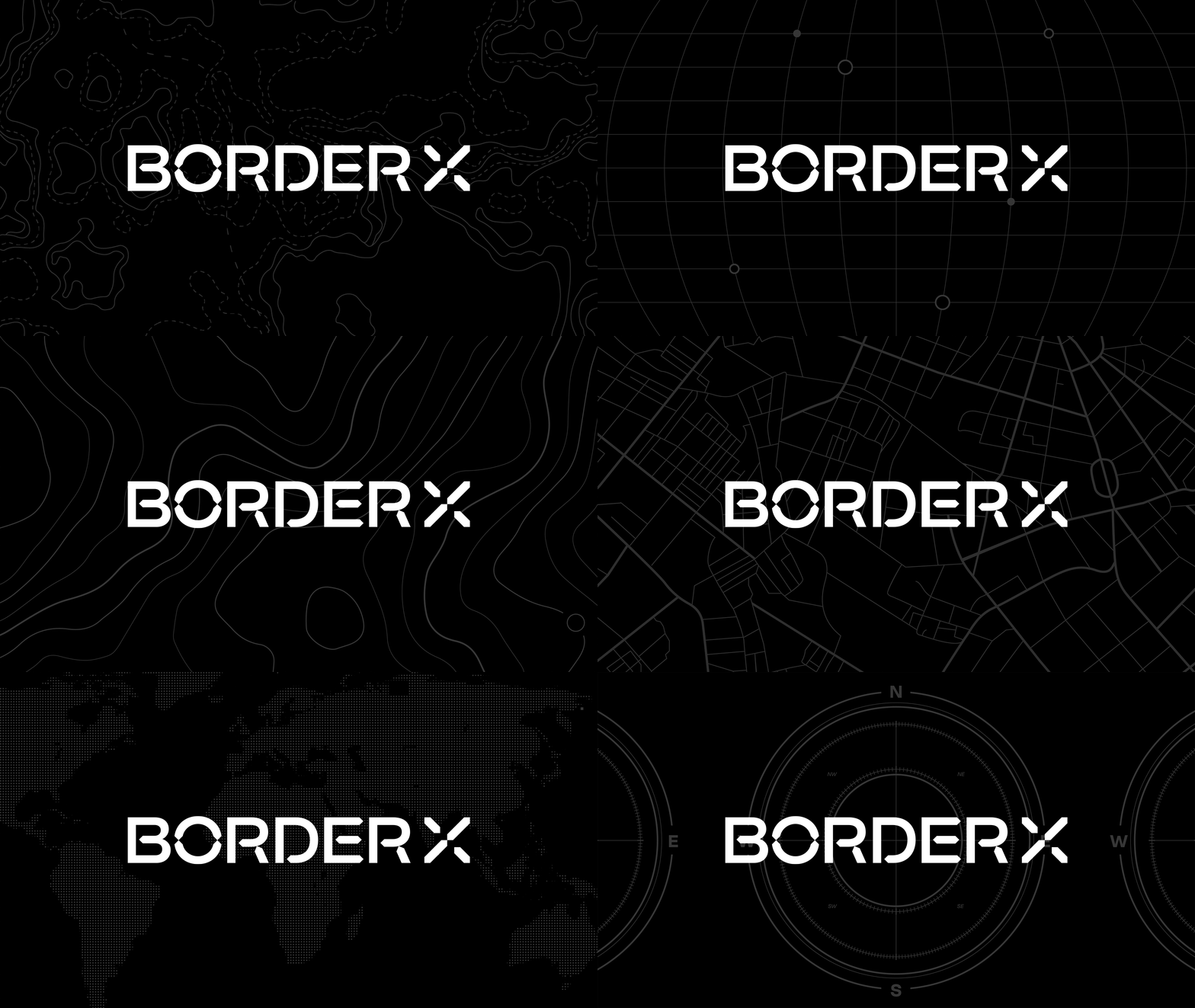
From its humble beginnings as a small marketing agency in Seoul, South Korea, the team at waymakrs always had a passion for helping brands go global. However, the growth that waymakrs experienced in 3 years helped focus its vision, mission, and direction in a major way. As an agency with a borderless outlook, the name BorderX came naturally. But it needed solid rebranding to support its renewed identity as BorderX. With consistent copy and design supporting its clear goals, the rebranding was unveiled with a flourish to its clients, potential clients, and job seekers.
The rebranding process kicked off with consideration of the goals. While BorderX still wanted to support brands going global, it lacked branding that would parallel its bold mission. Through the rebrand, BorderX wished to establish clear positioning, clarify the agency’s vision, and create a distinct tone of voice and visual identity system around its unique personality. From carrying out a SWOT analysis to finding keywords to define the agency, BorderX took to sharpening its identity more clearly, pinpointing its differentiators from other similar agencies.
With the patterns that emerged, 4 core values were identified. While the mission and vision had become more focused over the course of the agency’s lifetime, the positioning statement needed to be polished in order to accurately reflect the agency’s ambitious global purpose. The development of the slogan and tagline were jumpstarted by the keywords, and were intended to provide memorable impressions of a new journey.

Once the brand strategy began to take shape, the direction of the visual identity followed suit. The logo, inspired by the compass, represented its capacity to explore and lead brands looking to unleash their global potential. The color palette represented each of the team’s core values, and the typeface was consistent with BorderX’s expertise in the digital realm. These elements were then applied to social media, posters, business cards, and swag in order to share BorderX’s bold purpose with the masses.


